
Graphs, charts and tables are all used to describe data and make it easier for the data to be understood.
There are a number of graphs and charts that you need to be able to draw and interpret, they include:
- Tally chart (frequency table)
- Line graph
- Pie chart
- Bar chart
- Histogram
- Scatter diagram
- Distribution graphs
Drawing graphs and tables
Tally chart
Tally marks are used for counting things. These are used in content analyses and observations. They record the number of times something is seen.
| Observation of baby… | Tally | Total |
| Feeding | llll | 4 |
| Crying | ll | 2 |
| Sleeping | llll ll | 7 |
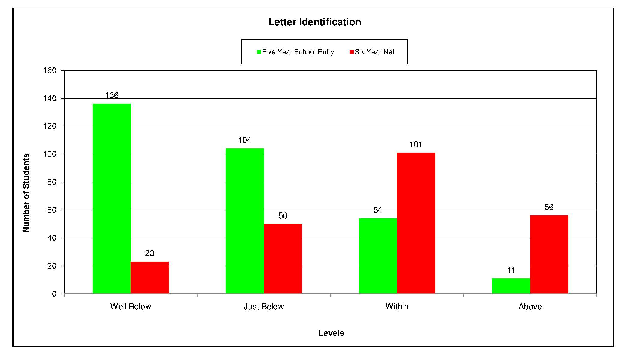
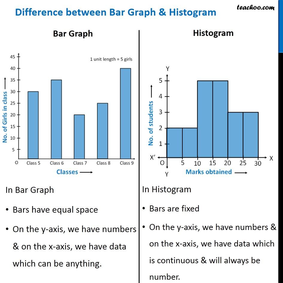
Bar charts can be used to represent the data from tally charts, mean scores or the totals. They are used with nominal or ordinal levels of measurement. The bars be separate from each other
Scatter diagrams: Are used with correlations where the relationship of two variables is summarised. They illustrate the direction of the relationship (positive, negative or zero correlation) and can indicate the potential strength of the relationship.
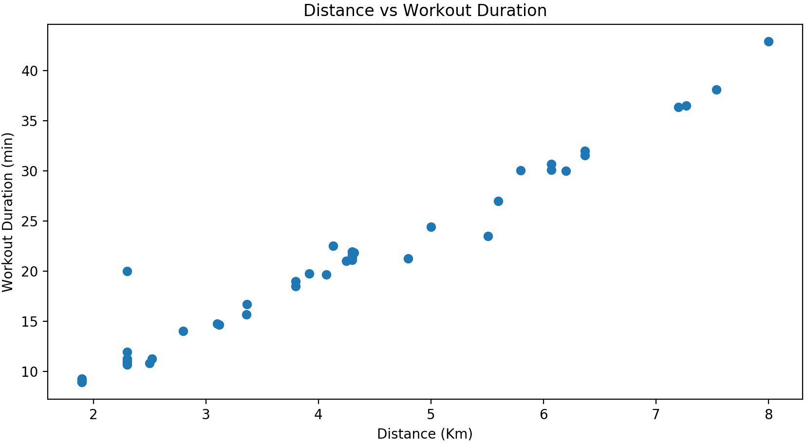
For example, this scatter graph shows a positive correlation.
Histograms: should be used to present continuous/interval data such as weight, height and temperature. Histograms unlike bar charts also have no gaps between the bars. Histograms always have equal sized intervals of data on the x axis, and the y axis always represents the frequency within each interval.
You may be interested to know how much time students spend on their homework. As an activity, you could ask other members of your class to reveal this for their last homework (although there may be some social desirability bias!) Hopefully the majority of your class spend around 100 minutes on their psychology homework!
Line graphs: Are also used with continuous/interval data and use points connected by lines to show how something changes in value, for instance, over time. Line graphs do not need to have equal sized intervals of data on the x axis, like histograms. Typically the IV will be on the x axis and the DV on the y axis.
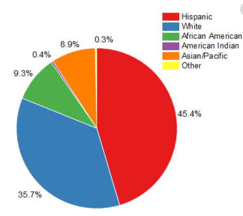
Pie charts: Are used when we have percentages in categories (nominal data). Each segment represents a percentage of the total.
Distribution Graphs:
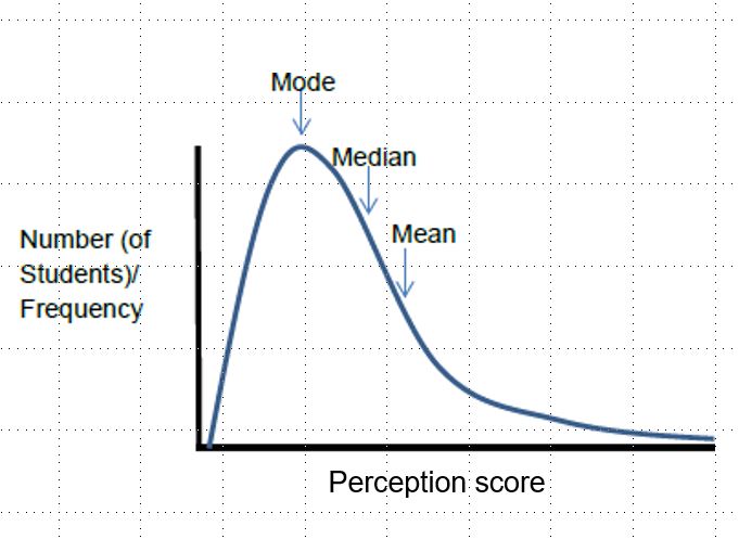
In real life situations, variables such as height, weight, shoe size, exam results, and IQ scores – all tend to show normal distribution when plotted on graphs. Within a normal distribution, most people tend to be located in the middle of the curve, with very few people at the extreme ends.
In a normal distribution the mean, median and mode all occupy the same mid-point on the curve. The ‘tails’ of the curve represent the extreme scores.
IMPORTANT! Please remember that on any distribution graph, the measure/score is always on the x axis, and the frequency ( number of participants who have achieved the score) is on the y axis.
Normal Distribution:

Positive Skew:
A positive skew indicates few high scores, and lots of low scores. Imagine I set you a really difficult test in which most of you got low marks with only a few of you getting high marks. In the case of a positive skew, the mode is at the highest point, then the median. The mean has been dragged to the right due to extreme scores.
Negative skew:
A negative skew indicates few low scores and lots of high scores. Imagine I set you a really easy test in which most of you got high marks with only a few of you getting low marks. In the case of a skew, negative skew the mode is at the highest point, then the median. But the mean has been dragged to the left because of extreme scores.

